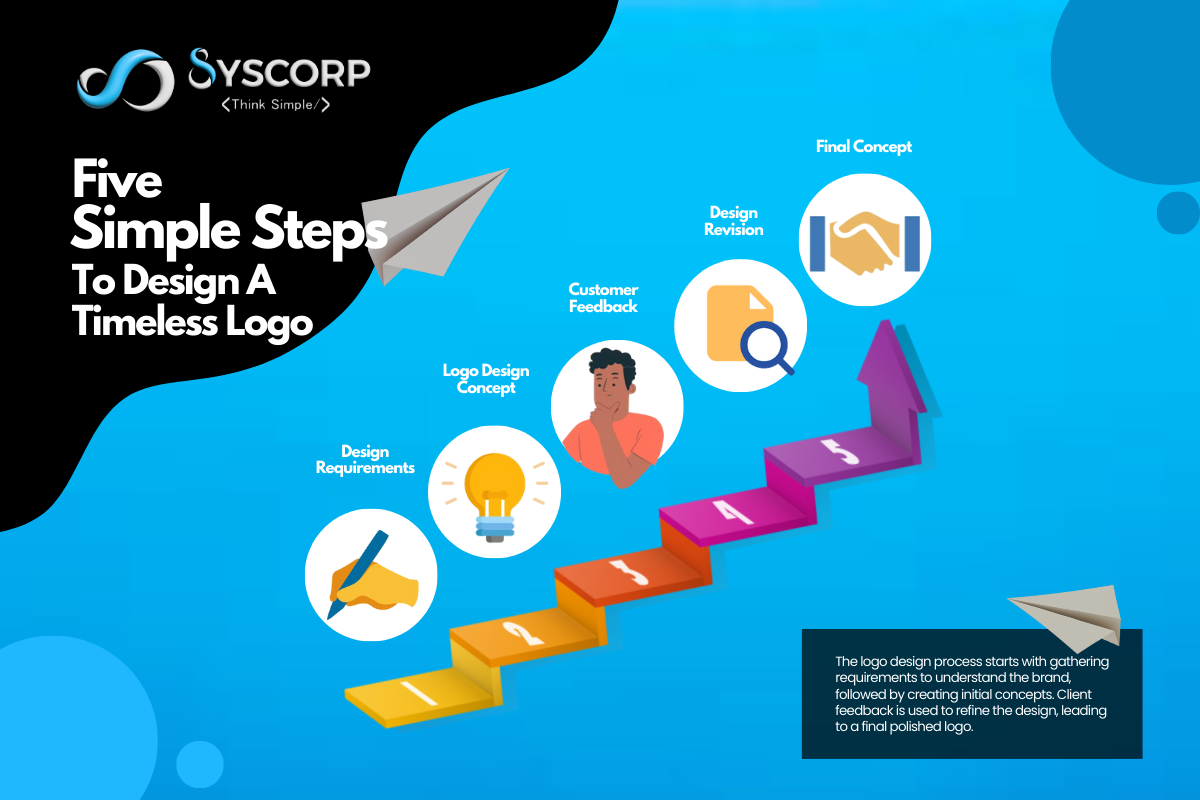
Five Simple Steps To Design A Timeless Logo
Introduction
Creating a timeless logo is an art form that combines creativity, strategy, and purpose. A logo is more than just a visual mark—it represents the essence of a brand, its values, and its message. In an age where Digital Marketing dominates, standing out requires a logo that not only captures attention but remains relevant through changing trends. Below, we’ll explore five essential steps to craft a timeless Logo Design that will endure for years to come.
Step 1: Understand the Brand Identity
Before you even think about colors or fonts, it’s essential to dive deep into the brand's identity. A logo is a visual translation of what the brand stands for. Take time to understand the core values, mission, target audience, and overall vision. Is the brand playful, sophisticated, eco-conscious, or tech-savvy? Each of these traits should be reflected in the logo.
Start by asking yourself:
What emotions should the logo evoke?
What is the brand’s unique selling point?
Who is the intended audience, and how do they view the brand?
A timeless logo transcends fleeting trends. Instead, it embodies the heart of the brand, ensuring that its message stays clear, even as design preferences evolve. By aligning the Logo Design with the essence of the brand, you create a lasting impression that stays true to its roots.
Step 2: Simplicity is Key
In the world of website Design, less is often more, and the same principle applies to logos. A complex logo might be visually stunning, but it can lose its impact when scaled down or used in different formats. Simple design guarantees that, on a billboard, business card, or website, a logo stays obvious and identifiable.
The most iconic logos in the world—think of Apple, Nike, or McDonald’s—are incredibly simple, yet they convey an unmistakable message. A timeless logo doesn’t need to scream for attention. Instead, it whispers elegance and clarity.
How to Keep it Simple:
Limit the use of colors. Too many can create confusion and reduce scalability.
Avoid overly intricate details that might become blurred when resized.
Stick to clean, bold lines and shapes that convey the message effortlessly.
By embracing simplicity, your logo will withstand the test of time, remaining relevant across various platforms and media formats in the ever-evolving landscape of Digital Marketing.
Step 3: Choose Versatile Typography
Typography is a subtle yet powerful element in any Logo Design. The right font can elevate the logo, while the wrong one can undermine its entire purpose. Timeless logos often incorporate typography that is clear, legible, and free from trends that may become outdated.
When choosing fonts, consider:
Legibility: The logo should be easy to read at all sizes.
Personality: Does the font reflect the brand's tone? While a bakery would choose something more fanciful and attractive, a computer company might go with clean, contemporary fonts.
Custom Fonts: For added uniqueness, consider creating a custom typeface. This adds an extra layer of originality to the logo.
Versatility is also crucial. The typography should look just as good on a business card as it does on a large sign or mobile app. Developing brand awareness depends mostly on consistency.
Step 4: Use Timeless Symbols and Imagery
Choosing the right symbols or imagery is where a lot of logos go wrong. While it might be tempting to use trendy symbols or illustrations that are popular at the moment, these can quickly become dated. Instead, opt for imagery that has stood the test of time—shapes, icons, or symbols that are universally understood and appreciated.
Consider:
Geometric shapes like circles, squares, and triangles. These have been used in design for centuries and are unlikely to go out of style.
Minimalist representations of concepts. For example, an outline of a mountain for a travel brand or a subtle leaf for an eco-conscious company.
Avoiding clichés. The use of overdone symbols like globes for tech companies or lightbulbs for creativity can dilute the originality of the logo.
Imagery should compliment the entire design, not overshadow it. A well-balanced use of symbols can give your logo that timeless feel, while still keeping it modern and relevant.
Step 5: Design for Flexibility
A timeless logo isn’t just about what looks good today; it’s about how well the design adapts to future trends and mediums. As your brand grows, so will the ways your logo is used. It needs to be versatile enough to work across both digital and physical platforms, from social media profiles to merchandise, from website headers to printed materials.
Consider designing multiple versions of the logo:
A full version with the name and symbol combined.
A simplified version that works as an icon or avatar for social media.
A monochrome version that retains its impact in black and white.
In the realm of website Design, responsive logos—those that adapt depending on screen size—are becoming increasingly important. Ensure your logo can be displayed beautifully on mobile devices, tablets, and desktops without losing its identity.
Conclusion
A timeless logo design is achieved through a balance of simplicity, relevance, and creativity. By following five essential steps—understanding the brand, choosing appropriate colors and fonts, ensuring scalability, incorporating meaningful symbols, and keeping the design versatile—you can create a logo that stands the test of time.
Syscorp Technology exemplifies excellence in logo design, offering services that focus on delivering creative and unique logos tailored to your specific brand needs. Their expert team ensures that the logos they create are not only visually appealing but also functional and timeless, helping businesses establish a strong and lasting identity in a competitive market.
Visit our website for more information: https://www.syscorp.in/
Share Your Comments